CLIENT & PROJECT
[ENA] Extraordinary Attorney Woo Styleguide & Kimbap Packaging
project overview
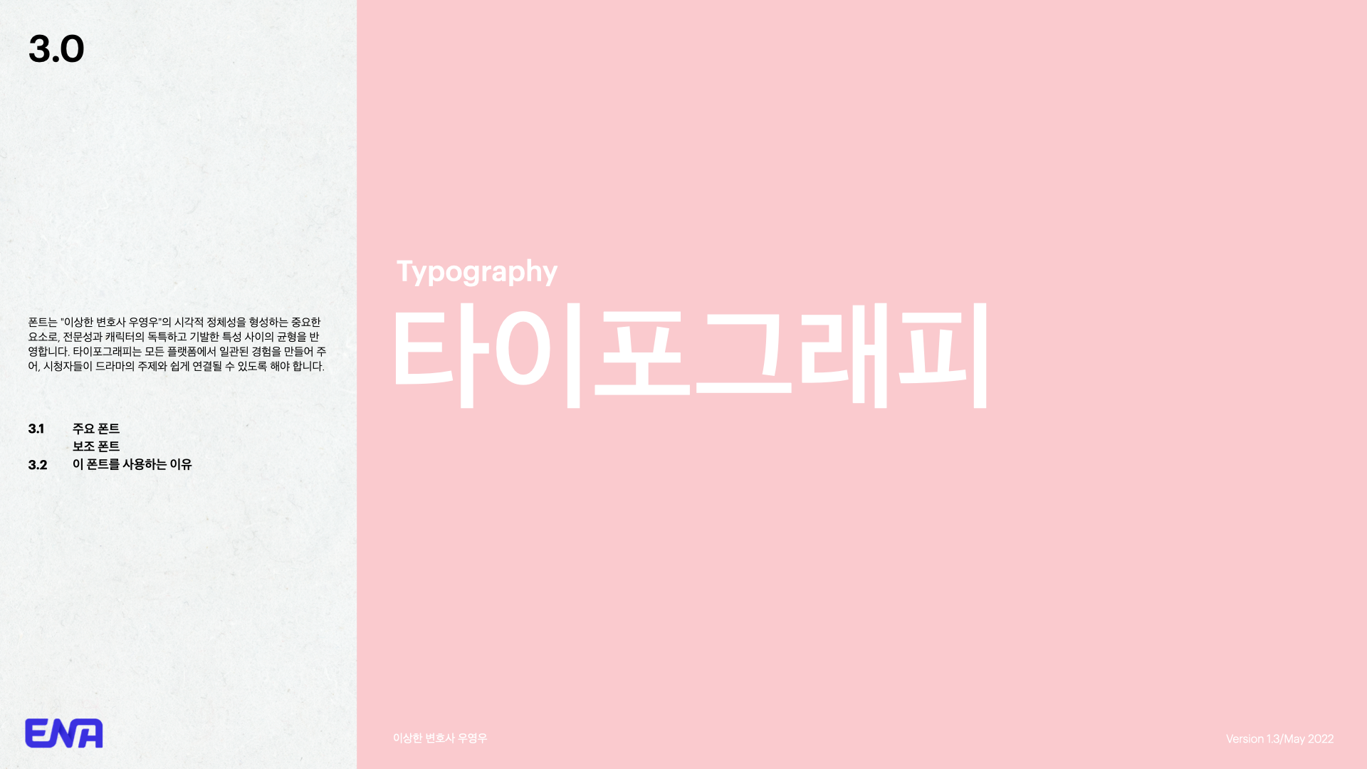
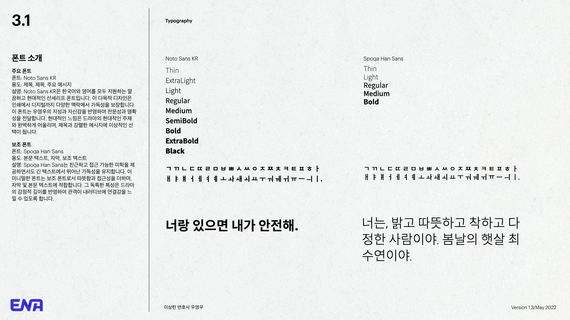
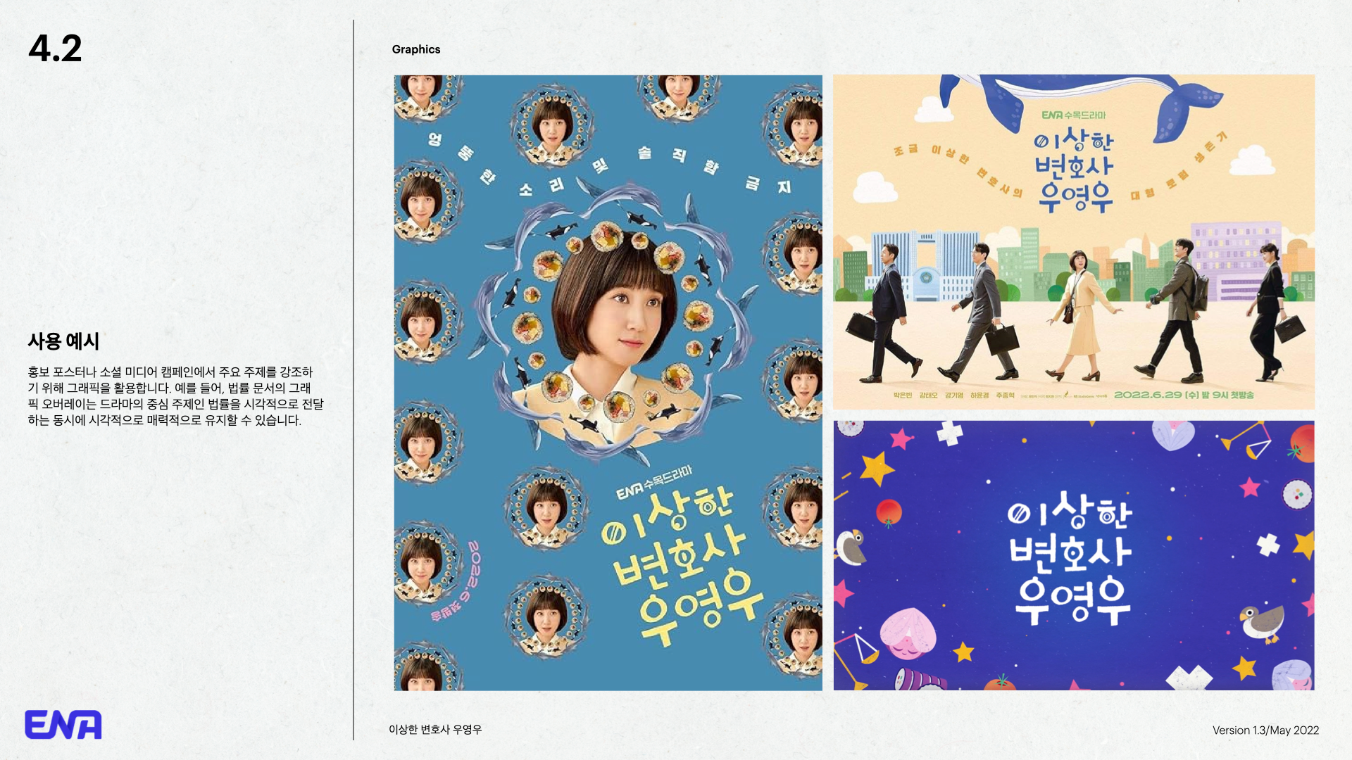
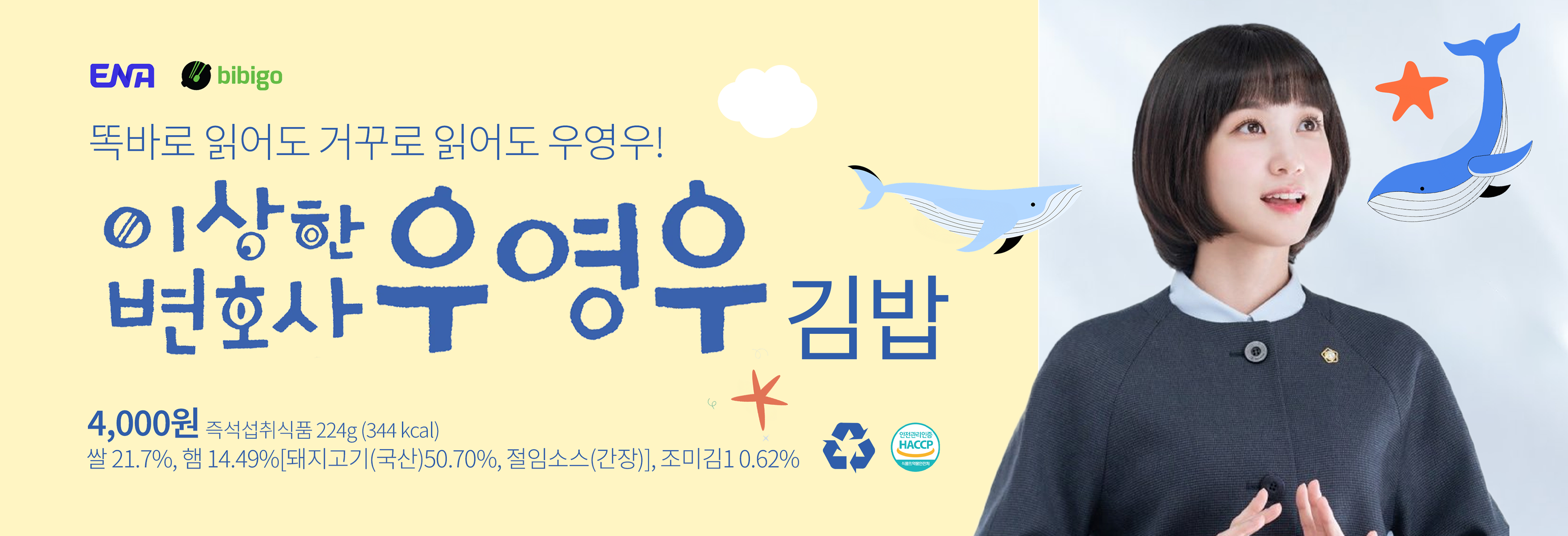
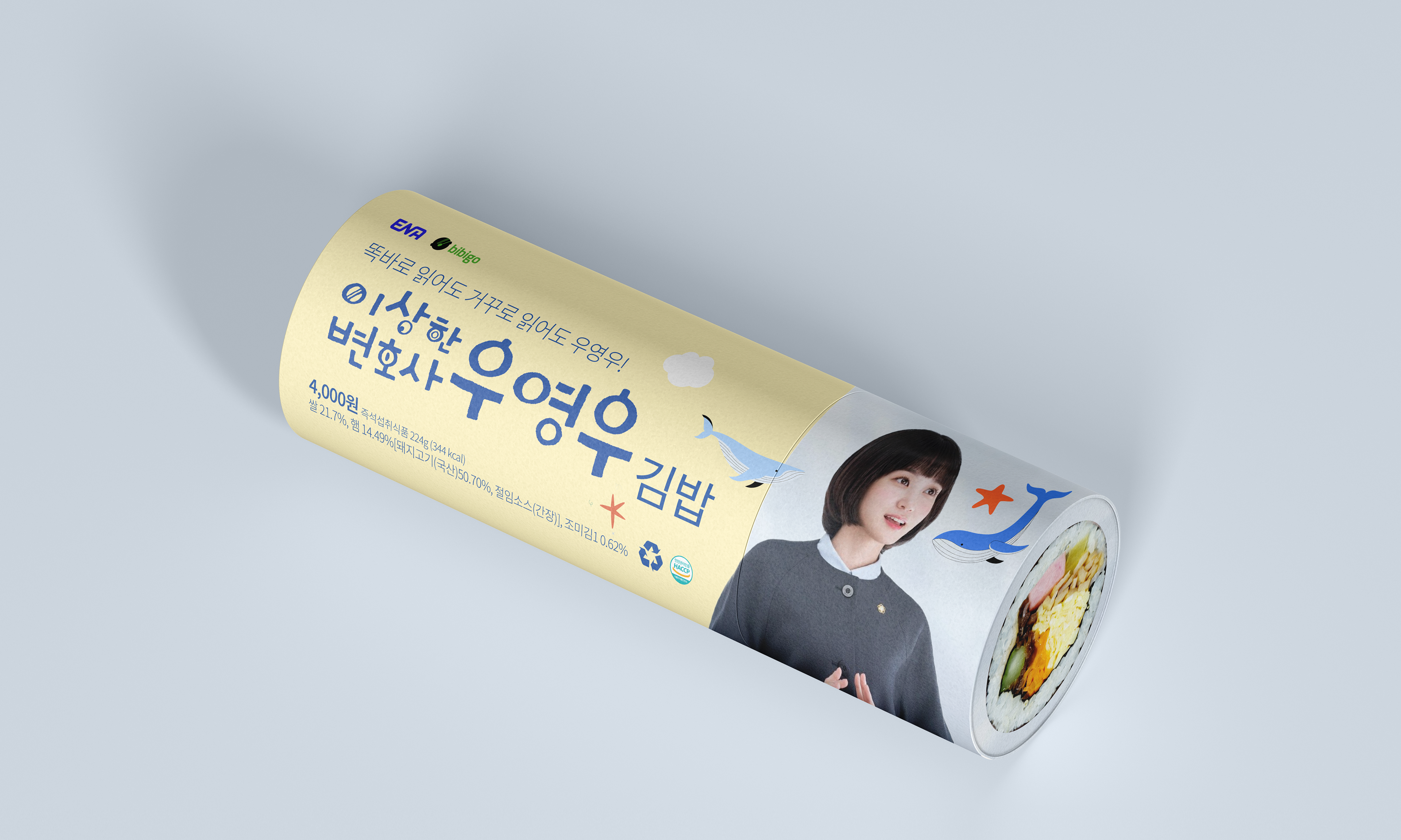
The Extraordinary Attorney Woo project was all about balancing simplicity with charm. While the styleguide itself was kept extremely simple and clear, designed entirely in Korean to ensure easy application across all platforms, the kimbap packaging was where the show’s cute and quirky personality truly came to life. We focused on capturing the series' playful spirit through vibrant colors, fun typography, and whimsical details that really embraced the show's unique vibe. It wasn’t just about visual consistency—it was about making sure every element felt true to the heart and character of the show.
Design Process
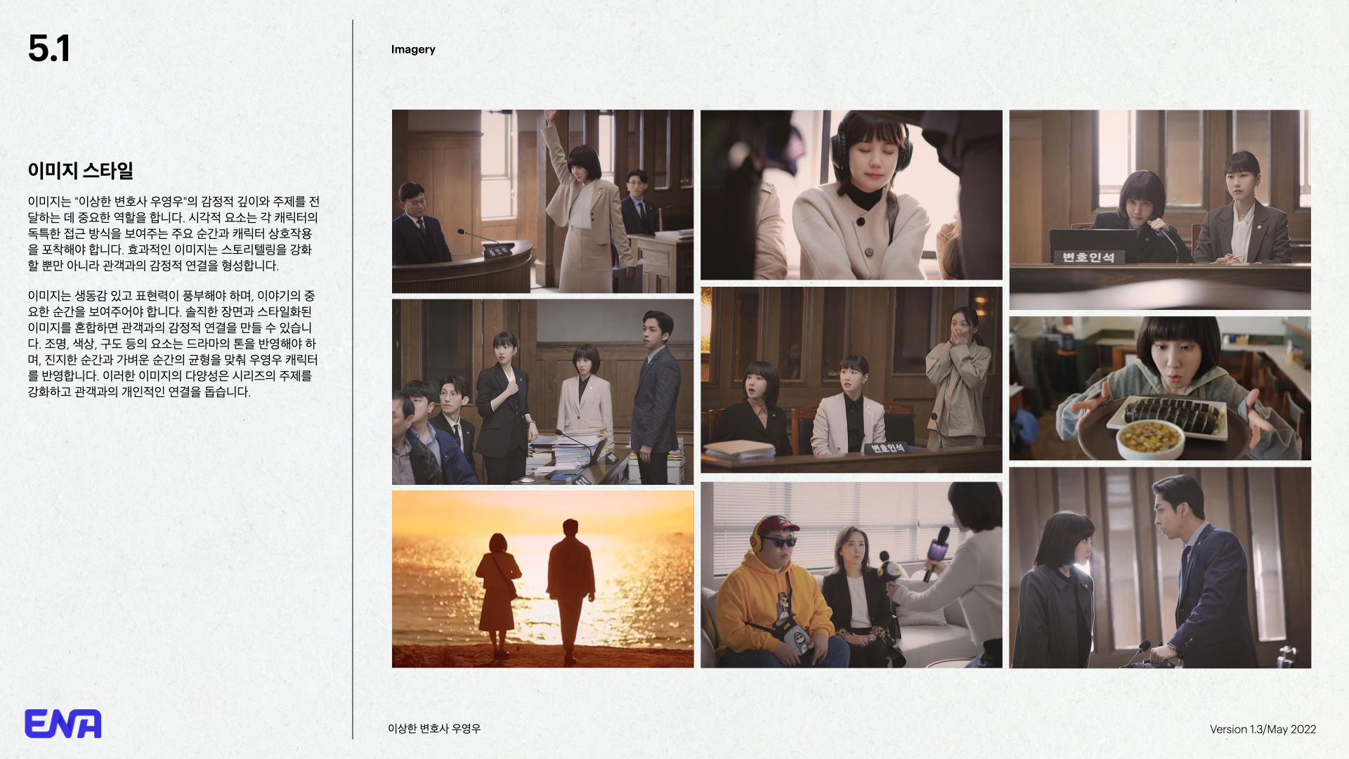
Understanding the Show’s Essence: We started by getting to the heart of Extraordinary Attorney Woo. We watched the episodes, soaked in the characters, and really tuned into its mix of legal drama with that signature quirky vibe. This set the tone for everything we did, guiding our approach to both the styleguide and the packaging design.
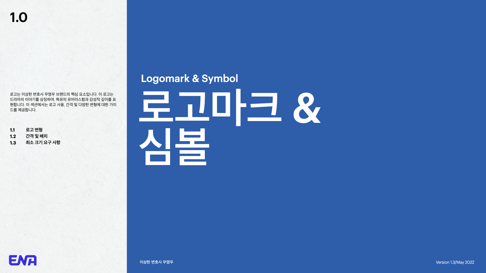
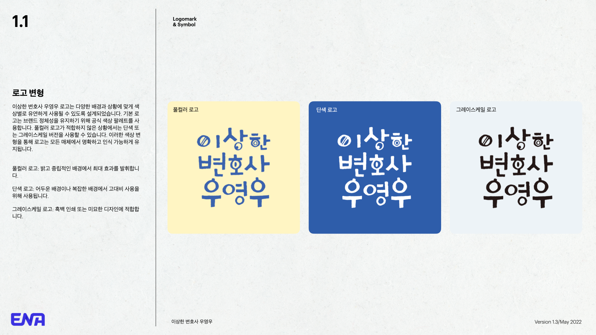
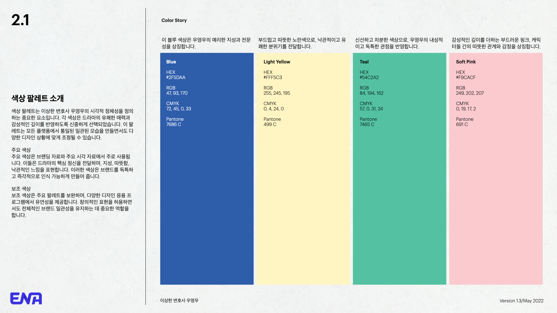
Styleguide Creation: We kept the styleguide super simple and straightforward, making sure it was designed entirely in Korean to be clear and easy to follow. We focused on clean typography, subtle color palettes, and basic graphic elements that aligned with the show's tone. It was all about creating something practical that could be easily picked up by anyone working with the brand.
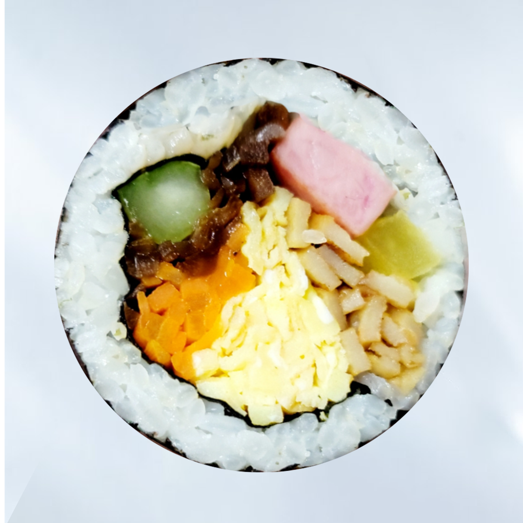
Kimbap Packaging Design: This is where we had some fun! Unlike the straightforward styleguide, the kimbap packaging was all about capturing the cute and quirky spirit of the show. We played around with vibrant colors and whimsical designs, bringing a little extra joy and personality to each detail, so fans could really connect with it.
Client Feedback and Revisions: We shared our ideas with the team, listened to their thoughts, and made some tweaks to make sure both the styleguide and packaging hit the mark. It was all about finding that sweet spot between practicality and the show's unique character.
Finalization: With all the pieces in place, we wrapped up the styleguide and kimbap packaging, tying it all together into a cohesive look that felt true to the show's spirit. The goal was to keep things versatile, engaging, and most importantly, fun.
Styleguide

Final Packaging Design
Results and reflection
The kimbap packaging design aimed to capture the essence of the main character—not just her quirks, but who she truly is. Through playful colors and thoughtful details, we reflected their story and personality in every element. The straightforward Korean styleguide kept things clean and allowed the packaging to speak to the show’s charm, making the characters’ nature come alive in a way that felt authentic and engaging.
team Credits
ENA 이상한 변호사 우영우